Startup pitch decks are key to fundraising but many are less than optimal. I’ve seen over a thousand pitch deck examples and I’m surprised at how many make mistakes.
I’ve written a slide-by-slide pitch deck guide but I’d like to go further with analysis of pitch deck examples. I hope this helps you improve your own.
Any pitch decks I review are either already public or published with permission.
I’m evaluating the decks on their effectiveness at telling a story that earns a live pitch. Pitch decks are usually first read online and asynchronously. A deck that’s presented live can have less information because the presenter fills in the rest.
This pitch deck example is from Harvest Money, a startup that published a draft of its deck for feedback. Sincere thanks to the founders for their transparency.
I encourage you to read this pitch deck as a potential investor. What is clear and unclear? What excites you and worries you?
If you’d like to have your pitch deck reviewed, please email it to [email protected].
Title Slide

Strengths
- Attractive graphic
- Short, descriptive slogan
Weaknesses
- No website URL, social media handles, or contact information
The title slide should briefly say what the company does and make it easy to learn more or follow-up. The lack of website and contact links means investors need to search for them.
Grade: C
Team Slide
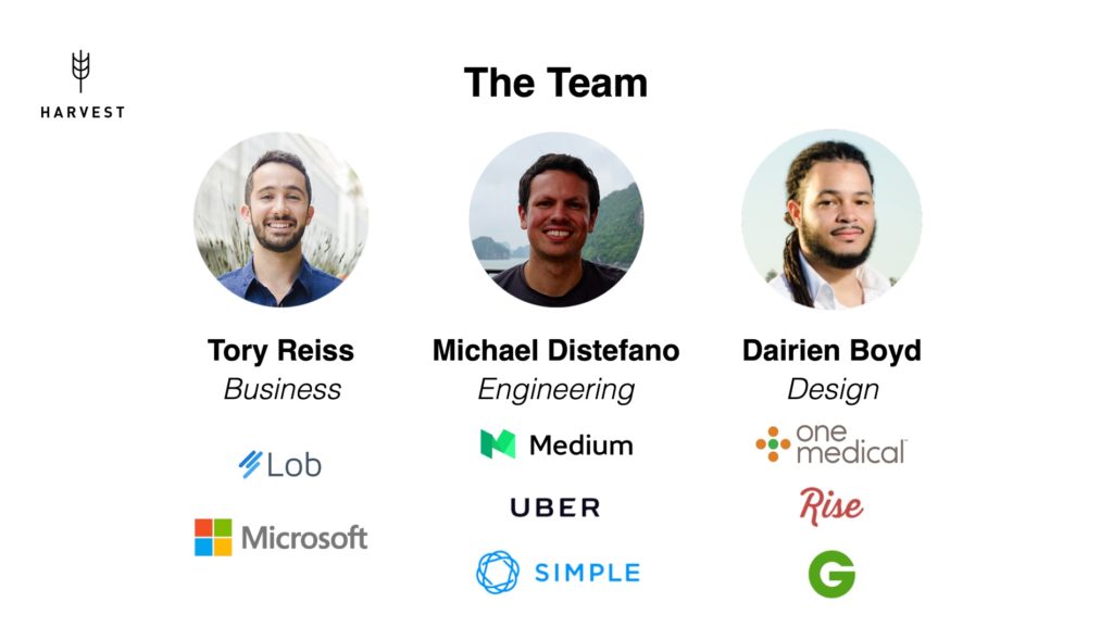
Strengths
- Focuses on the founders, not ancillary team members
- Headshot photos
Weaknesses
- No titles
- Shows logo billboards, not accomplishments
The team slide should convey why you are uniquely suited for the opportunity. I like this slide’s focus on the founders, which is who investors will want to know the most about.
The lack of titles raises a question: who is the CEO? Some startups defer naming a CEO or name co-CEOs, which usually ends poorly. Use standard titles like VP of Engineering or Lead Designer.
I don’t like company logos on team slides. They take up a lot of space and only show that you passed an admission test. I prefer 2-3 bullet point accomplishments, ideally related to the market.
Grade: D
Solution Overview Slide
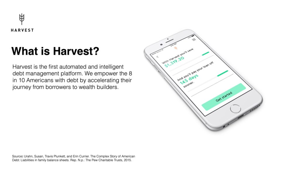
Strengths
- Large, illustrative product image
- Short description
- Data citation
Weaknesses
- None
Good slide. I quickly understand what the company wants to do and who it is for. A nit is that I’d split the two sentences into separate paragraphs to make them pop.
The citation is fine when read remotely but in a live pitch, the text would be too small to read. Move citations to an appendix slide and hyperlink them to sources.
Grade: A
Why Now Slide
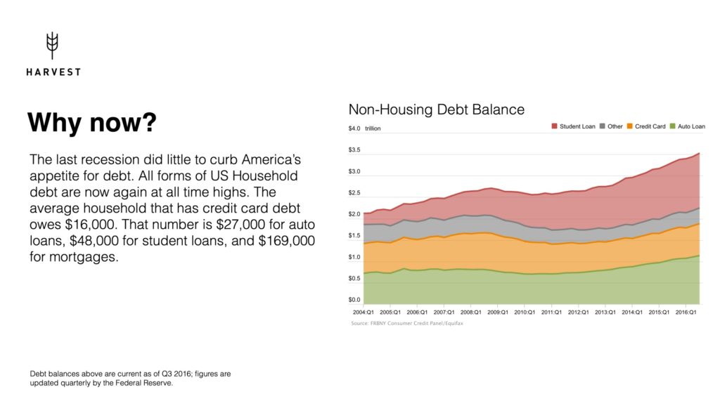
Strengths
- Relevant chart and stats
Weaknesses
- Only one market timing factor
The why now slide should explain why the opportunity exists or what changes enable it. This slide only cites one factor: the growth of personal debt. Is that the only one?
I would like to see 1-3 more factors, such as growth in the use of personal finance apps, access to deeper data sets, and new machine learning algorithms.
Space for this could be created by moving the individual debt numbers to the graph. While the national debt balances are relevant, individual debt is what will drive user adoption.
I would also move this slide to later in the deck, after the problem and solution are fleshed out. It’s awkward to describe why something should exist before you’ve fully described what it is.
Grade: C
Problem Slide
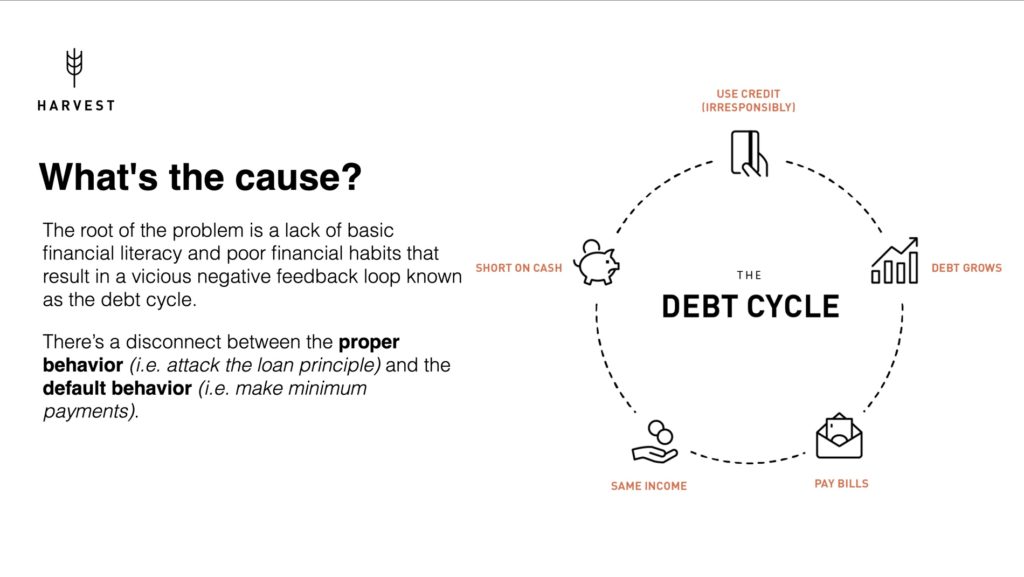
Strengths
- Succinctly describes the root problems
- Useful graphic
Weaknesses
- None
A good slide that describes the root problem and sets up why Harvest addresses it. I would add consumerism as a factor.
Grade: A
Solution Slide
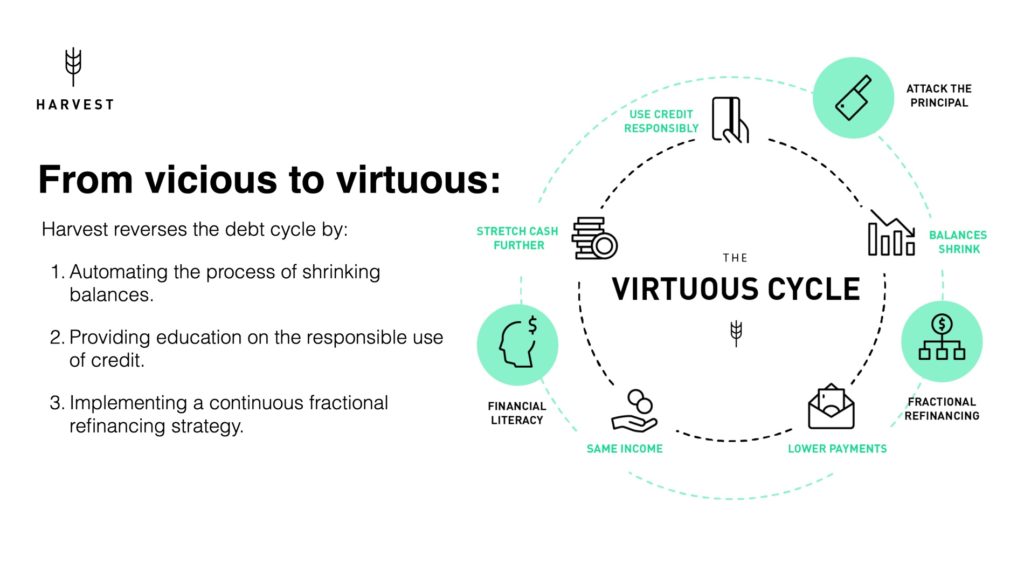
Strengths
- Builds on previous problem slide
- Short descriptions
Weaknesses
- Busy graphic
- “Continuous fractional refinancing” is unclear
I like how Harvest uses the previous slide’s framework to describe the product and its benefits.
The number of icons and captions is getting high so I would consider reducing those to focus attention.
I like the first two product features but I don’t know what “continuous fractional refinancing” is and neither does Google. The Harvest deck is the only search result in the world for that phrase – an impressive feat! – but a sign to use a clearer term.
Grade: B
Product Slide
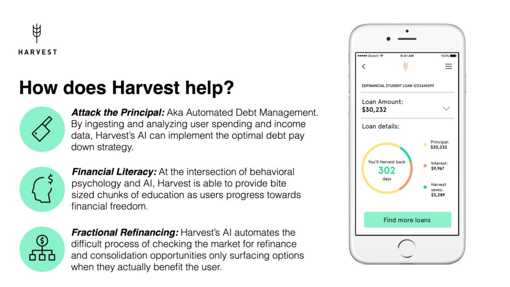
Strengths
- Describes product benefits
- Large graphic and icons
Weaknesses
- Descriptions don’t add much
I like that Harvest is telling a consistent story with its features and icons, but this slide doesn’t add much beyond detail beyond the previous slide.
I’d rather see this slide expanded into three slides that show screenshots and details of each major feature. I’ll admit I’m a product-focused investor but for a consumer app, good product design is so important so I think it’s worth it.
Grade: C
Business Model Slide
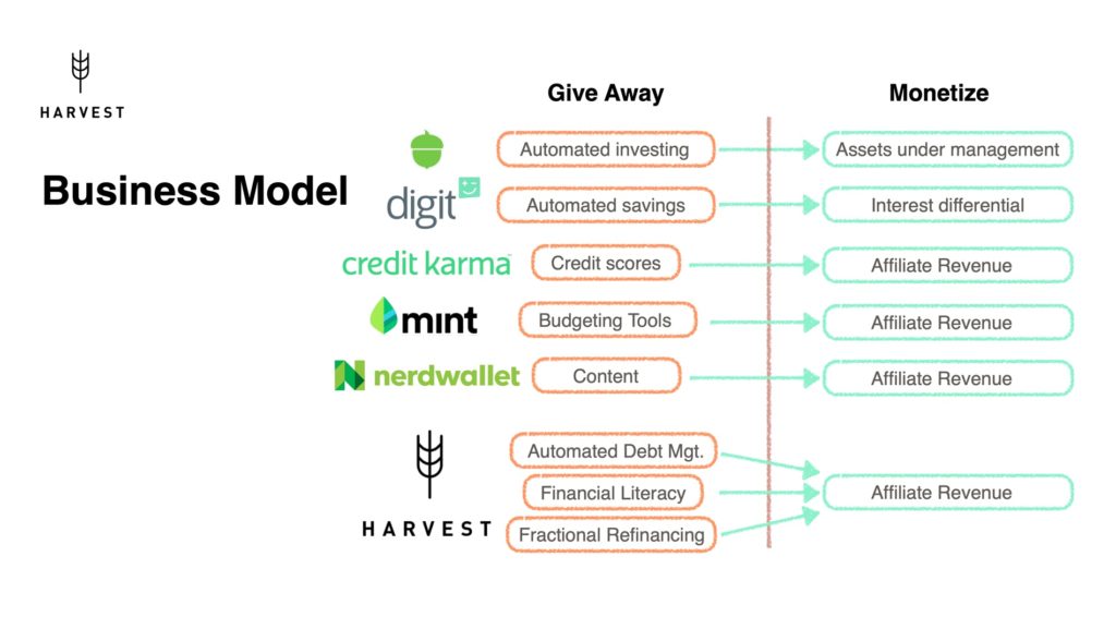
Strengths
- None
Weaknesses
- No description of economics
- No description of buyers/advertisers
- Busy
A poor slide. The business model should describe what you sell, who pays you, and how much they pay. The only really relevant piece of information here is “affiliate revenue”.
The comparison to other companies is not important enough to dominate the slide. I’d rather see examples of affiliates, expected CPC/CPA, and how these numbers can get to $100M in annual revenue.
Charging consumers a percent of money saved or a premium feature fee are also worth considering.
Grade: F
Business Model Slide 2
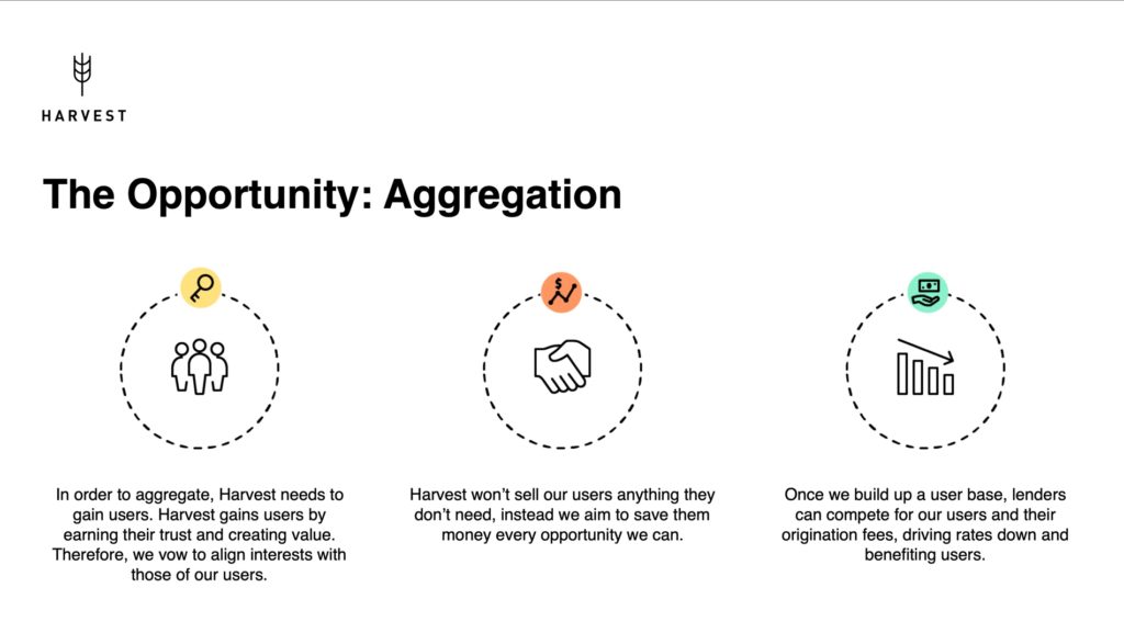
Strengths
- Loosely explains strategy
Weaknesses
- Info too basic
- A bit too wordy
The strategy here is rather obvious so I’d rather see deeper analysis of the economics. How many users are needed to attract lenders? How much will they pay?
Too many words are about earning user trust by aligning with them, which sounds trite. Will Harvest do anything bold to earn that trust, like revealing its affiliate revenue or open sourcing its code?
Grade: F
Go-to-Market Strategy
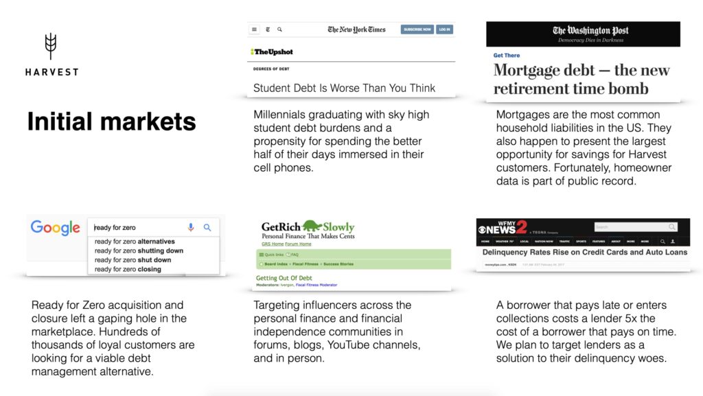
Strengths
- Shows consideration of initial markets and strategy
Weaknesses
- Scattered, confounds markets and marketing
- Screenshots not a good use of space
A poor slide. I’d rather see this separated into two slides: a description of the initial customers and a marketing plan to reach them. Combining them into one slide makes it shallow.
The initial customers slide could describe 1-3 target personas, like a millennial living in an urban center with student debt, and how many of each there are.
The marketing slide could describe how many relevant influencers there are, how they’ll be partnered with, and how many consumers can be reached through them. The current marketing plan is way too shallow.
Grade: D
Vision
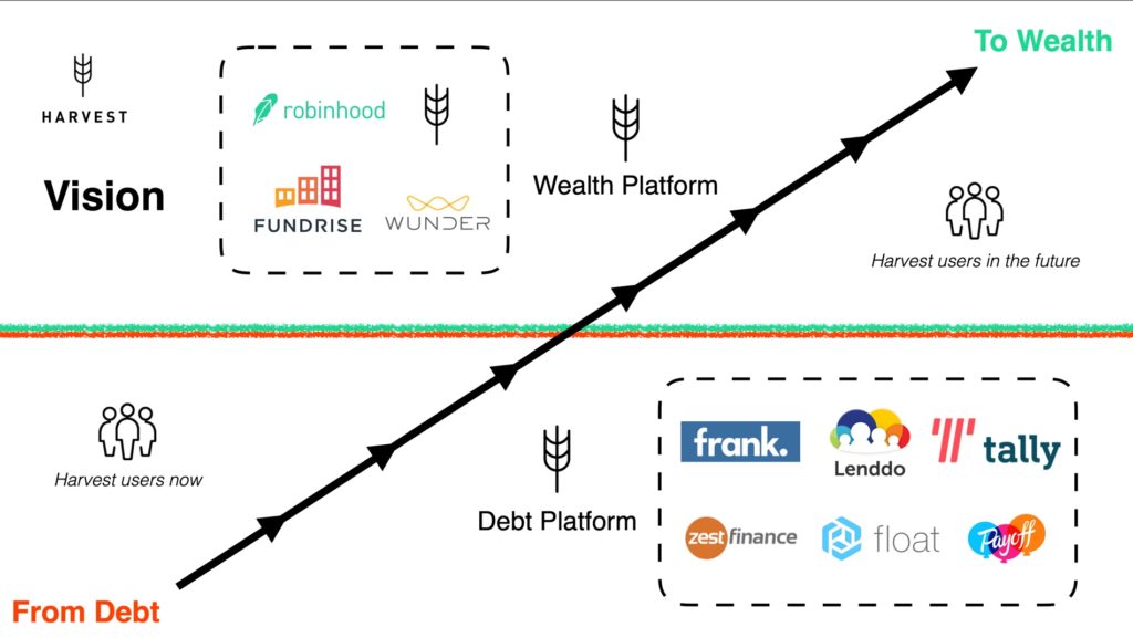
Strengths
- None
Weaknesses
- Confusing as hell
Oof, the worst slide in the deck. It has four copies of the Harvest logo, arrows streaming across the slide, and bunches of disconnected competitor logos. The point that Harvest wants to create wealth for its users is obvious. Kill this slide with fire.
Grade: F
Competition
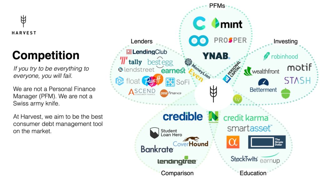
Strengths
- None
Weaknesses
- Contradictory message
- Too busy
This is a petal competition slide, pioneered by Steve Blank. It’s intended for companies creating a new market.
New markets are rare. For example, Uber, Lyft, and Taxi Magic created the on-demand ride hailing market in 2008-2009.
Harvest doesn’t seem to be creating a new market. It’s a consumer debt management app that competes at least indirectly with apps like Tally and Debt Book.
The slide is also contradictory. It says “if you try to be everything to everyone, you will fail”, but then depicts itself as an intersection of five different markets.
I’d rather see Harvest list its direct competitors and explain its advantages. Those seem to be a combination of education, automation, and ease of use.
I’d also like to see why the company will be defensible. Are there high switching costs or network effects?
Grade: D
Timeline Slide
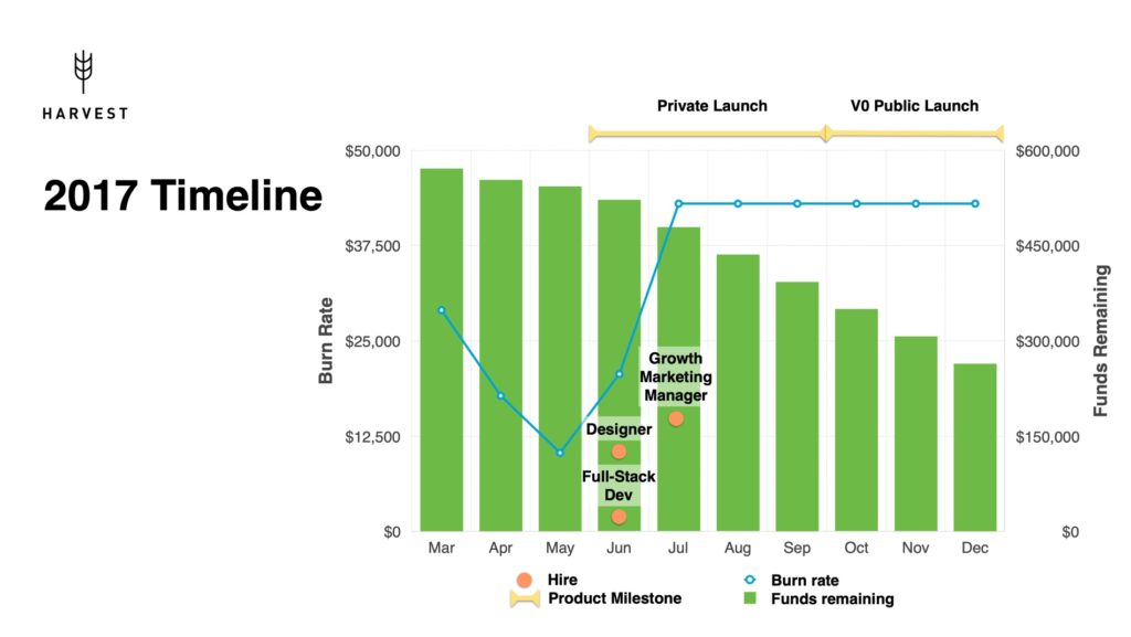
Strengths
- None
Weaknesses
- Irrelevant information
- Way too busy
This slide makes my head hurt. It tries to convey historical burn rate, cash on hand, headcount, and launch dates in one overwhelming graph. No bueno.
What Harvest has done is also not as relevant as where it wants to be.
I’d rather see a timeline that starts at today, then extends 12-18 months on 2-3 axes: product milestones, business milestones, and maybe headcount. Show what you want to achieve with the funding you’re asking for.
I appreciate the month-by-month planning of burn rate and cash on hand but that should be on a separate financials slide. Segmenting the vertical bars into spending categories (e.g. salaries, marketing, operations) would be nice.
Grade: D
Use of Funds
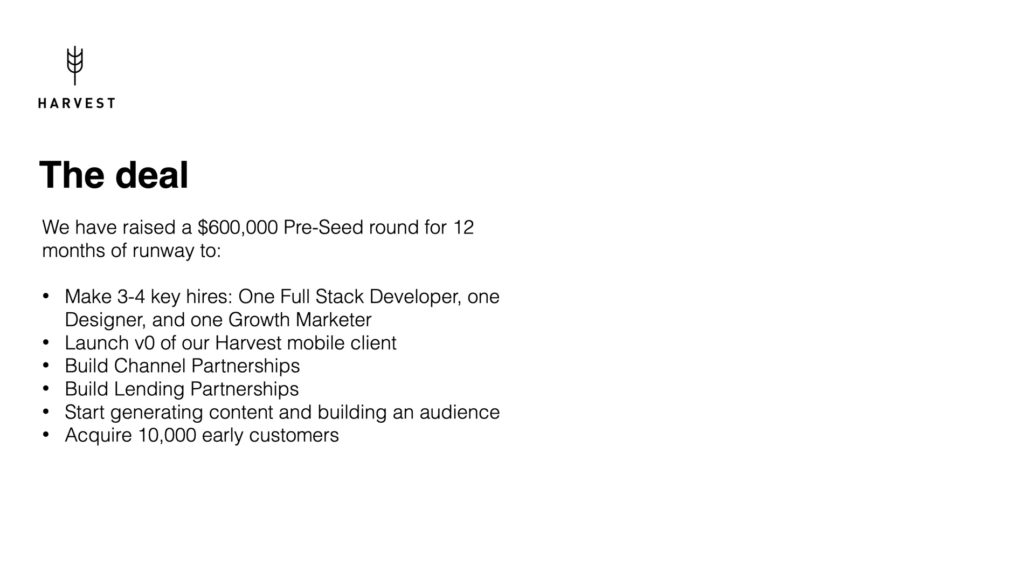
Strengths
- Somewhat relevant info
Weaknesses
- Doesn’t say target funding amount
- Design too basic
The information here is fine but it’s not presented well. I’d rather see a visual timeline of the milestones, how much Harvest is asking for, and how the funding will be allocated to these goals.
I’d also like to see who invested the $600k and the terms.
Grade: C
Missing Slides
Some common slides are missing from the deck:
- Marketing plan: beyond a mention of pursuing influencers, there is no plan or economic projection for user acquisition. This is the biggest omission in the deck.
- Traction: despite a public launch, no mention of user #s, app ratings, or retention. Always a red flag.
- Market size: no bottom-up analysis of how big the market is.
- Financials: no estimate of future costs, revenue, or headcount.
- Summary: no end slide that summarizes the pitch or shows contact information.
- Appendix: not strictly necessary but a list of hyperlinked citations or resources is helpful.
The first three of these are essential and so they get a grade of I for incomplete.
Overall Grades
| Title | C | Go-To-Market | D |
| Team | D | Vision | F |
| Solution Overview | A | Competition | D |
| Why Now | C | Timeline | D |
| Problem | A | Use of Funds | C |
| Solution #2 | B | Marketing | I |
| Product | C | Traction | I |
| Business Model | F | Market Size | I |
| Business Model #2 | F | ||
| Overall | C- |
Summary
Thanks again to the Harvest founders for their transparency. It takes courage to post a pitch deck for public feedback. My critiques are only for the pitch deck, which is a draft, and not the founders.
Overall, I like the deck’s clean design, even though some slides are busy. Harvest’s mission and product are clear but its traction, business model, marketing plan, competitive edge, and financials need to be clarified.
If I had been pitched this deck, I still would have taken a meeting. It’s interesting enough to learn more in-person, which ultimately is the goal of a deck sent online. It looks like other investors agreed because Harvest eventually raised $1M in seed funding.
Unfortunately, Harvest closed earlier this year. It’s too bad because I think the idea had promise. I wish the founders success in their next projects and I hope this pitch deck example is helpful.
I haven’t been able to find much information about Harvest online… do you know what ultimately led them to failure?
Hey Jason, I did eventually connect with the thoughtful CEO of Harvest Money and learned more of their story. However, I want to respect their privacy and defer to them on whether they’d like to say more. I hope you understand.
Mark